EAGLES LOGO CONSTRUCTION
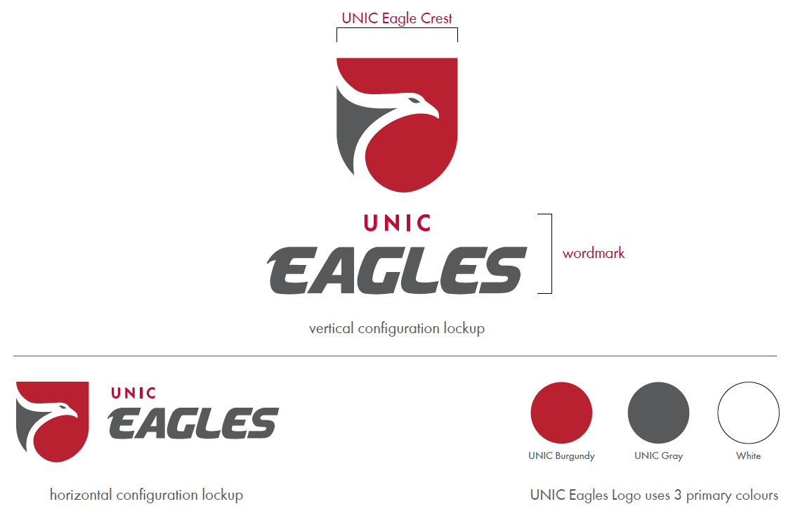
The Eagles logo comprises the wordmark and the UNIC Eagle Crest in a consistent relationship.
In order to maintain maximum visual impact and accommodate varying space limitations, the Eagles logo has two configurations: vertical and horizontal.
Logos should not be redrawn, re-coloured, edited or altered in any way. Fonts should never be replaced.
MONOCHROME VERSIONS
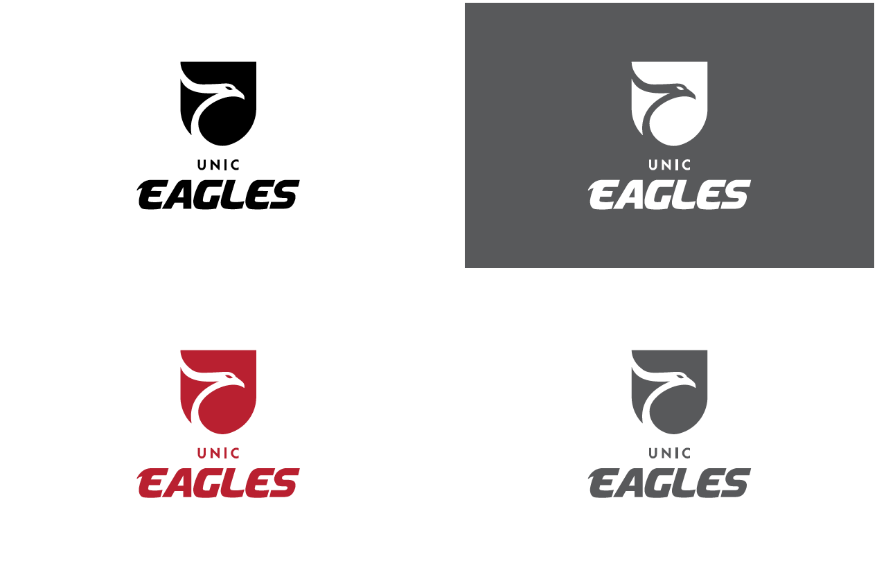
Monochromatic logos are available only for black-and-white and monochromatic scenarios.
However, the UNIC Eagles logo should only be used in its monochromatic versions when colour printing or multi-colouring is not available in either print or digital format.
CLEAR SPACE AND MINIMUM SIZES
To maintain its impact and immediate visual recognition, no text, graphic element, or edge should interfere with the logo.
RULES
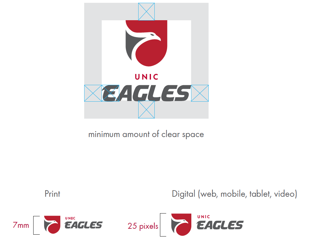
The minimum amount of clear space required around the logo is equal to the width of the initial E in the wordmark. This clear space is a minimum and should be increased where possible. The clear space must be maintained on all sides of the logo.
MINIMUM SIZES
To maintain full legibility and visual recognition, never reproduce the logo at heights (UNIC Eaglescrest) smaller than 7mm tall for print and 25 pixels tall for digital.
BACKGROUND CONTROL
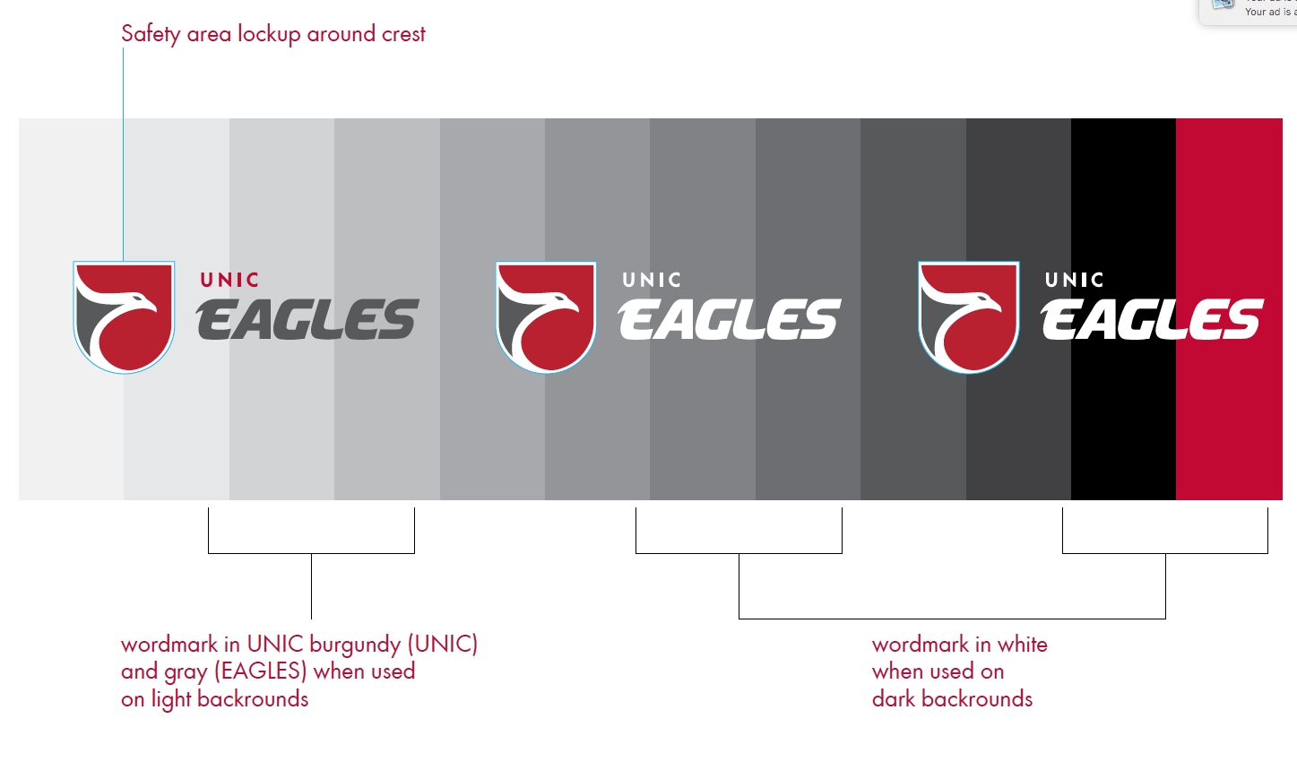
To allow proper readability and maximum visual impact, a safety area is set around the crest. The wordmark can be UNIC burgundy and gray or white. depending on the darkness of the background.
USAGE WITH AN INTERNAL OFFICE OR DEPARTMENT
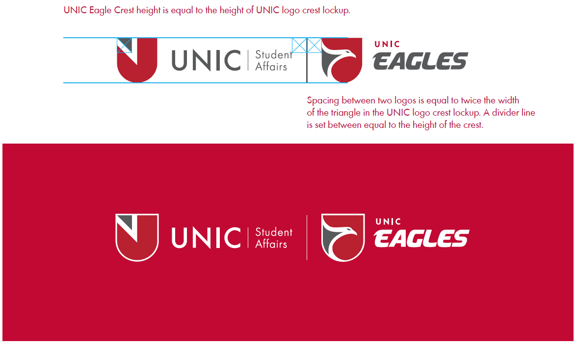
The Eagles logo can be used alongside an administrative office or department.
Use the width of the triangle in the crest as a measuring tool to help.
