LETTERHEADS
What we write makes a powerful statement about who we are. Applying our identity elements in a consistent way plays an important part in this.
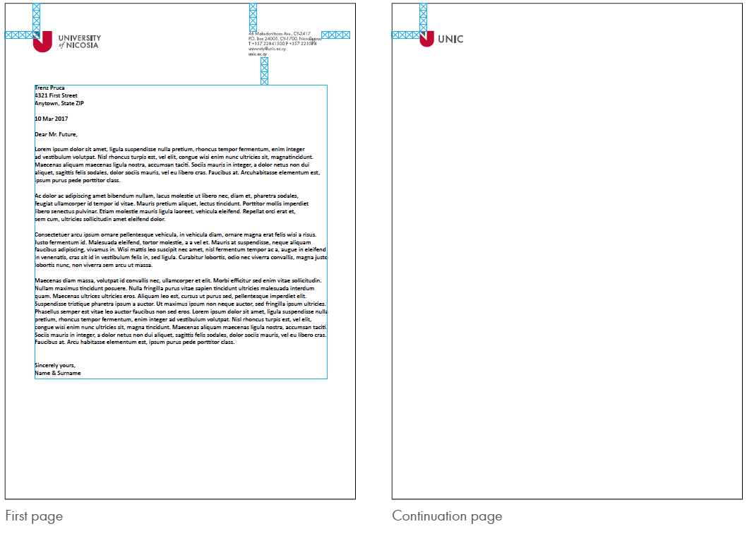
The UNIC logo and information are locked in the template and cannot be altered.
Spacing
Elements should have a clear space of 4 triangles from the crest from the top of the page and from the left and right of the page.
Body text
The top of the body should have a minimum space of 4 triangles from the closest element. For the text of the letter, we recommend using the Calibri font at 11pt. If Calibri text is unavailable use either Times New Roman or Arial.

SCHOOL LETTERHEADS
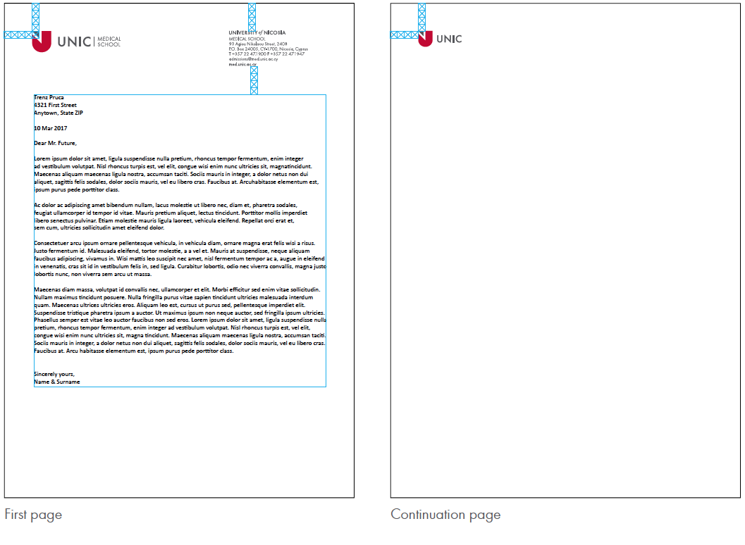
The logo and information are locked in the template and cannot be altered.
Spacing
Elements should have a clear space of 4 triangles from the crest from the top of the page and from the left and right of the page.
Body text
The top of the body should have a minimum space of 4 triangles from the closest element. For the text of the letter, we recommend using the Calibri font at 11pt. If Calibri text is unavailable use either Times New Roman or Arial.

BUSINESS CARDS
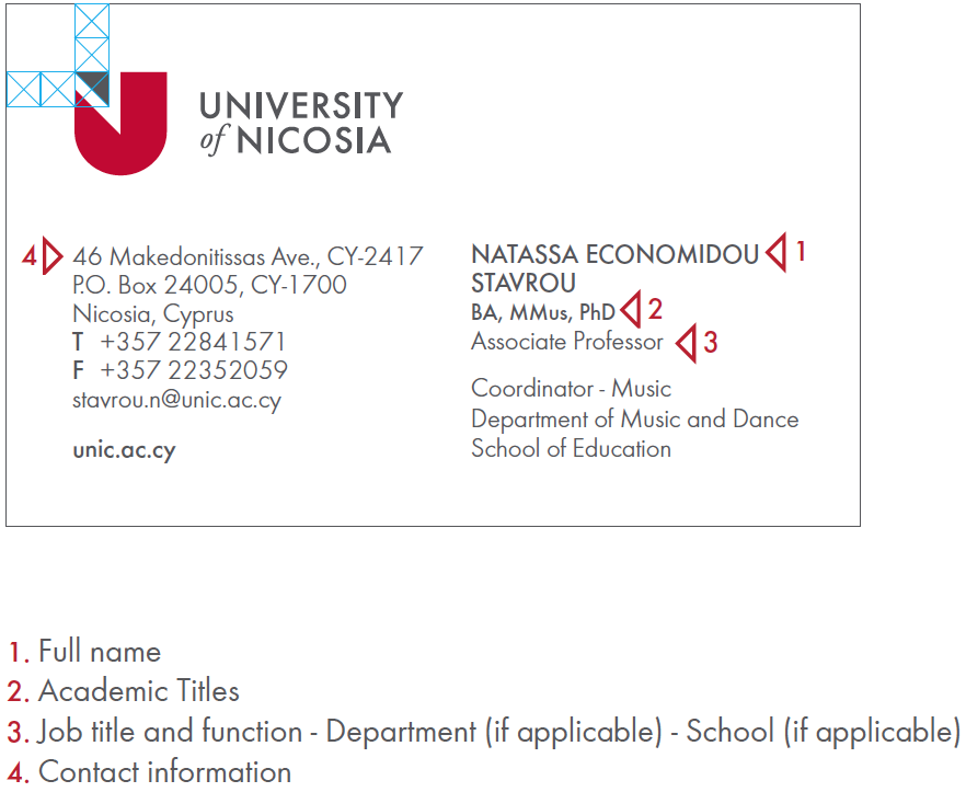
It is important to tell people who we are, what we do and where we work.
Our business cards must present UNIC in a clear, consistent way.
The UNIC logo is locked in the template and cannot be altered. The information on the card is standardised and positioned uniformly.
Text
Use FUTURA Light & Medium.

