TYPOGRAPHY
When used in a consistent and thoughtful way, typography becomes a powerful brand tool that can add visual meaning to communications. UNIC’s typography communicates clearly and with clarity, and is flexible in a wide range of situations.
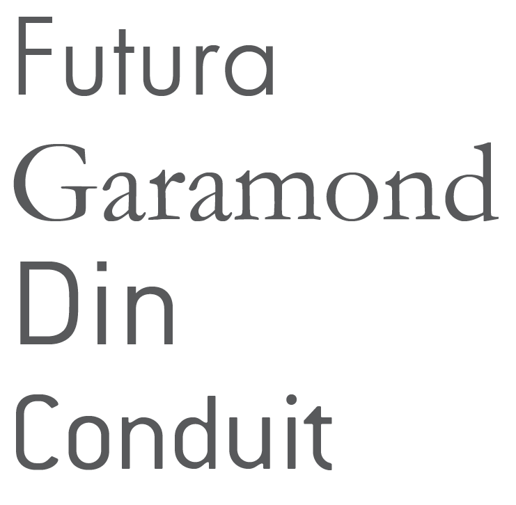
Four approved fonts comprise our typographic palette — Futura, Garamond, Din, and Conduit — that allow for creative expression of our brand personality in ways that are appropriate for our diverse audiences.
Our brand typeface, Futura family, was selected because it is clean, open and legible at all sizes.
FUTURA
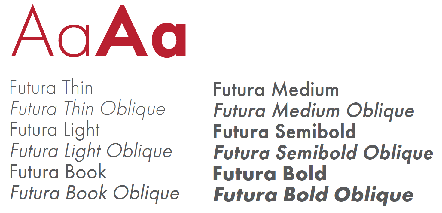
Futura expresses the university personality in a distinctive manner. It may be used in headlines, subheadings, and limited body copy applications. It is available in a variety of approved weights and formats.
GARAMOND
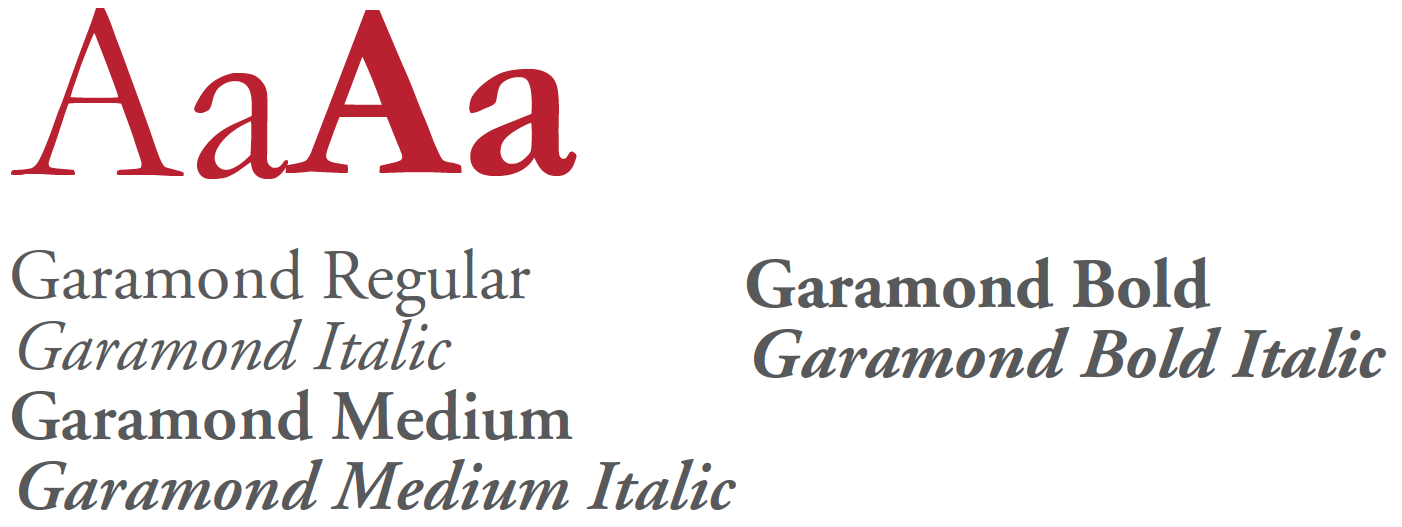
Garamond is a serif font that can be used in headlines, subheadings and quotations, that denotes a more traditional and formal look.
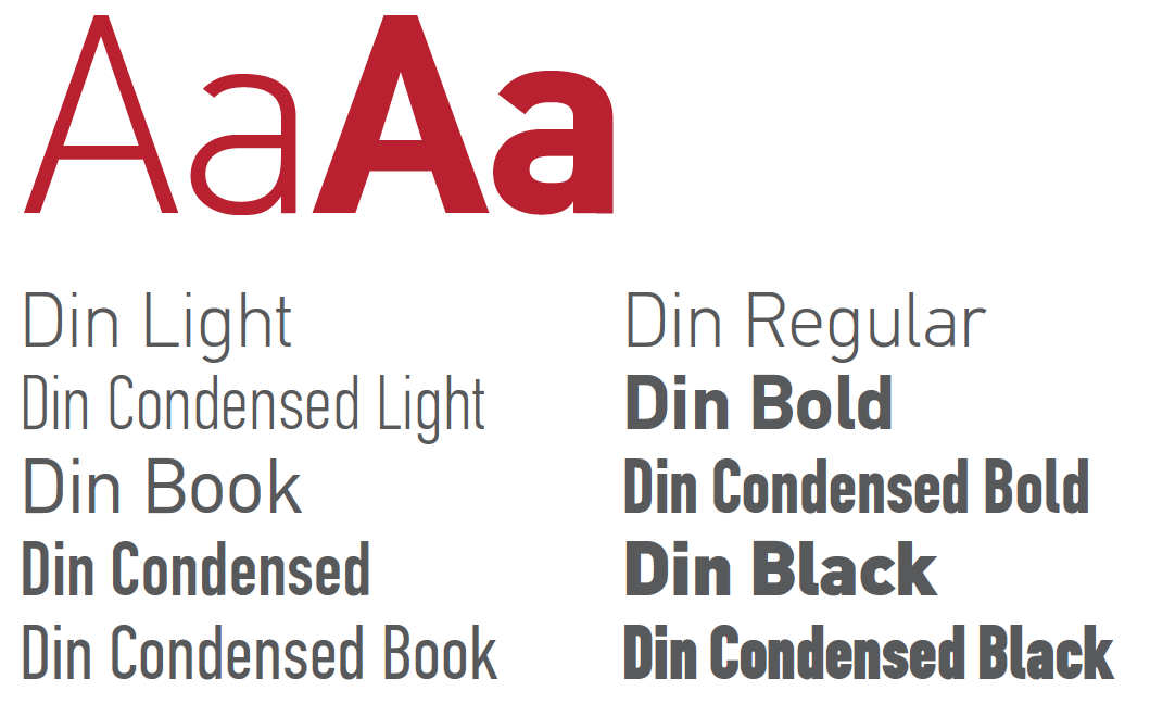
DIN
Din is a sans serif font used for body copy and headlines for an impressive and clean visual impact. For headlines it is recommended to be used only in all caps and in short lines and phrases between 3 and 8 words.
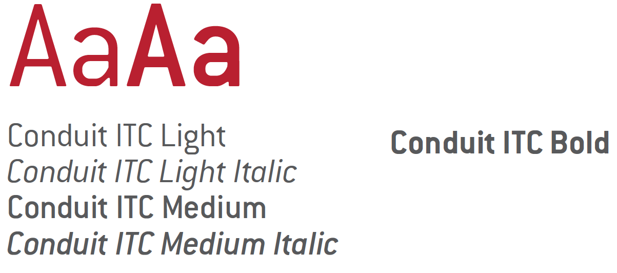
CONDUIT
Conduit, a sans serif font with a close typographic relationship to Din, is a body copy font. It is clean, simple and friendly.
USING TYPE
The way we use type is crucial to making our designs look professional. Use these tips to make sure the typography is consistent.
LEADING
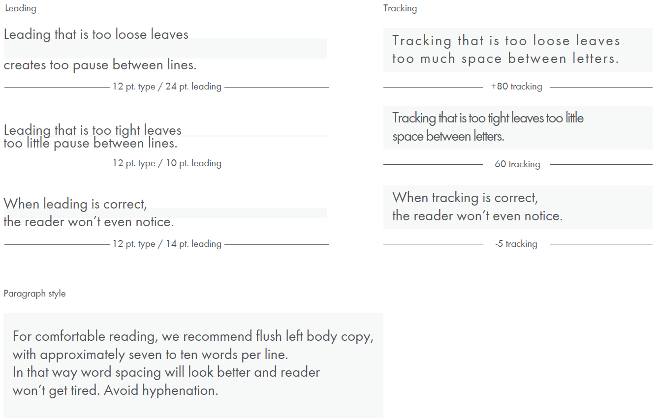
Line spacing, called leading, is essential to setting professional-looking type that is easy to read. Leading should be set tight, but not too tight.
TRACKING
Correct letter spacing, called tracking, is needed to make type legible. The Futura Family should always be tracked slightly tighter than the default setting, and optical kerning should be used when available.
PARAGRAPH STYLE
For comfortable reading, we recommend flush left body copy, with approximately seven to ten words per line. In that way word spacing will look better and reader won’t get tired. Avoid hyphenation.
